Components
Demo Time includes several visual components to enhance your presentations.
Arrow
The dt-arrow component draws an arrow with customizable properties:
<dt-arrow x1="0" y1="100" x2="480" y2="100" line-color="#15181f" line-width="2" arrow-head="both"></dt-arrow>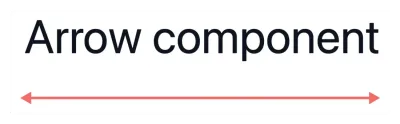
Properties
x1andy1: Coordinates for the starting point.x2andy2: Coordinates for the ending point or dimensions.line-color: Color of the line or border.line-width: Thickness of the line or border.arrow-head: Type of arrow head to use.end: Arrow head at the end (default)start: Arrow head at the startboth: Arrow heads at both ends
Rectangle
The dt-rectangle component draws a rectangle with customizable properties:
<dt-rectangle x1="25" y1="30" x2="375" y2="75" line-color="var(--vscode-editorError-foreground)" line-width="2" fill-color="transparent"></dt-rectangle>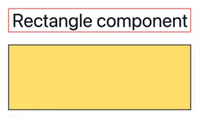
Properties
x1andy1: Coordinates for the starting point.x2andy2: Coordinates for the ending point or dimensions.line-color: Color of the line or border.line-width: Thickness of the line or border.fill-color: Fill color for the shape (usetransparentfor no fill).
Circle
The dt-circle component draws a circle with customizable properties:
<dt-circle x1="25" y1="25" x2="125" y2="85" line-color="#ffd43b" line-width="4" fill-color="transparent"></dt-circle>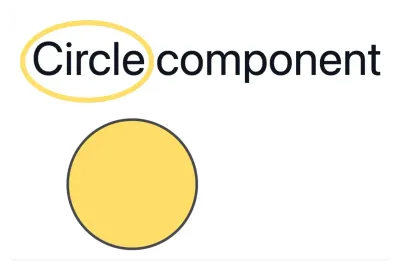
Properties
x1andy1: Coordinates for the starting point.x2andy2: Coordinates for the ending point or dimensions.line-color: Color of the line or border.line-width: Thickness of the line or border.fill-color: Fill color for the shape (usetransparentfor no fill).
List
The dt-list component allows you to progressively reveal list items one by one with each click during your presentation. This makes it easier to present step-by-step lists without manually wrapping each item in a dt-show component.
Usage
You can use either Markdown or HTML list syntax inside the dt-list component. Each list item will appear one by one as you advance through your slide:
<dt-list>- First step - appears on first click- Second step - appears on second click- Third step - appears on third click- Final step - appears on fourth click</dt-list><dt-list type="ol"> <li>First step - appears on first click</li> <li>Second step - appears on second click</li> <li>Third step - appears on third click</li> <li>Final step - appears on fourth click</li></dt-list>Properties
type(optional): Set toolfor an ordered (numbered) list. Defaults to unordered list if omitted.clicks(optional): The click on which the first item appears (default is1). Use it to reveal the list after other click steps on the slide.
<dt-show>The plan</dt-show>
<dt-list clicks="2">- Appears on the second click- Appears on the third click</dt-list>Action
The dt-action component adds a button to your slide that runs a scene by its id, the same way as the API and the URI handler. Use it for a “Run it” button next to a code sample, an “Open the terminal” button on an exercise slide, or an agenda slide where each item jumps to its act.
<dt-action id="run-tests">Run the tests</dt-action>The id refers to the id of a scene in one of your act files:
scenes: - id: run-tests title: Run the tests moves: - action: executeTerminalCommand command: npm testTo jump to an act, use the id of its first scene. Use variant="link" to show the component as a link, for instance on an agenda slide:
1. <dt-action variant="link" id="intro">Introduction</dt-action>2. <dt-action variant="link" id="first-demo">The first demo</dt-action>3. <dt-action variant="link" id="wrap-up">Wrap-up</dt-action>Clicking the button or link doesn’t count as a click step. In the PDF export and the next-slide preview of the presenter view, it shows as a static button or link.
Properties
id: Theidof the scene to run. When no scene has thisid, the slide file shows a warning in the Problems panel.variant(optional):button(default) orlink.
The text between the tags is the label. Without a label, the component shows the id.
Styling
The component uses the link color of the slide theme. You can change it with these CSS variables, on the slide or in a custom theme:
| Variable | Description |
|---|---|
--demotime-action-background | Background color of the button |
--demotime-action-color | Text color of the button |
--demotime-action-border | Border of the button |
--demotime-action-radius | Border radius of the button |
--demotime-action-padding | Padding of the button |
--demotime-action-font-size | Font size of the button |
--demotime-action-font-weight | Font weight of the button |
--demotime-action-shadow | Box shadow of the button |
--demotime-action-hover-opacity | Opacity of the button on hover |
--demotime-action-link-color | Text color of the link |
--demotime-action-link-hover-color | Text color of the link on hover |
--demotime-action-focus-color | Color of the focus outline |
dt-action { --demotime-action-background: #ffd43b; --demotime-action-color: #15181f; --demotime-action-radius: 999px;}For more control, style the inner element with the ::part(action) selector, or ::part(button) and ::part(link) for one variant.
Finding the right coordinates
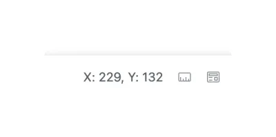
When you open the slide in the preview mode, you can click on the ruler action to see the coordinates of the mouse pointer. This will help you find the right coordinates for your components.