
Custom Components
Beside the built-in components, you can also create your own custom components to enhance your slides.
On this page, we will explore how to create a custom text highlighting component using web components.
Creating a custom component
To start, we will create a custom web component called dt-highlight with Lit that allows us to highlight text with different colors and padding.
import {  css,  html,  LitElement} from 'https://esm.run/lit';
/** * The `dt-highlight` component allows you to highlight text with customizable properties: * * ```html title="Highlight text" * <dt-highlight *   color="#ffd43b" *   text-color="#000000" *   padding="0.25rem"> *   This text will be highlighted * </dt-highlight> * ``` * * Properties * * - `color`: Background color of the highlight * - `text-color`: Color of the text (optional, defaults to current text color) * - `padding`: Custom padding around the text (optional, defaults to 0.25rem) */export class TextHighlight extends LitElement {  static styles = css`    .highlight {      display: inline-block;      padding: var(--padding, 0.25rem);      background-color: var(--highlight-color, #ffd43b);      color: var(--text-color, inherit);      border-radius: 0.2rem;    }  `;
  static properties = {    color: { type: String },    textColor: { type: String, attribute: 'text-color' },    padding: { type: String }  };
  constructor() {    super();    this.color = '#ffd43b';    this.textColor = null;    this.padding = '0.25rem';  }
  render() {    const style = {      '--highlight-color': this.color,      '--text-color': this.textColor,      '--padding': this.padding    };
    return html`      <span class="highlight" style=${Object.entries(style).map(([k,v]) => v ? `${k}:${v}` : '').join(';')}>        <slot></slot>      </span>    `;  }}
customElements.define('dt-highlight', TextHighlight);
Registering the component
Once you have created the component, you need to register it in your Visual Studio Code project file:
{ "demoTime.customWebComponents": [ "highlight.js" ]}Using the component
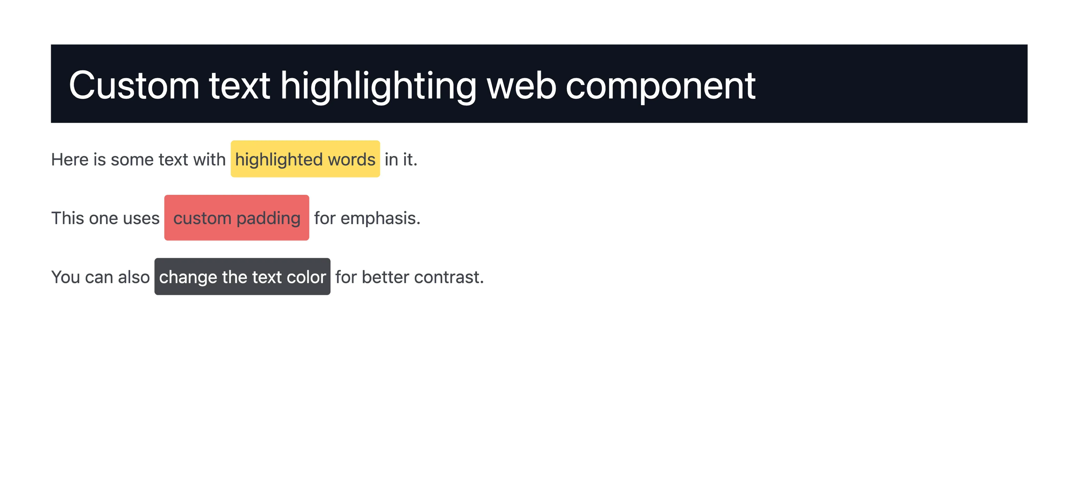
Now that you have registered the component, you can use it in your slides. Here are some examples of how to use the dt-highlight component:
# Custom text highlighting web component
Here is some text with <dt-highlight color="#ffd43b">highlighted words</dt-highlight> in it.
This one uses <dt-highlight color="var(--vscode-editorError-foreground)" padding=".5rem">custom padding</dt-highlight> for emphasis.
You can also <dt-highlight color="#15181f" text-color="#ffffff">change the text color</dt-highlight> for better contrast.
Open your slide in the preview and you will see the highlighted text with the specified colors and padding.
Reduced motion
If your component animates, respect the reduced motion
setting of the presenter. While reduced motion is on, the slide preview has a data-reduced-motion
attribute on its <html> element, and a demotime.reducedMotion event fires on window when it
changes:
const isReducedMotion = () => document.documentElement.hasAttribute('data-reduced-motion');
window.addEventListener('demotime.reducedMotion', (event) => {  console.log('Reduced motion:', event.detail.reducedMotion);});
In the styles of your component, you can use the attribute with the :host-context() selector, or
in a global stylesheet with :root[data-reduced-motion].