
Theme Builder
The Theme Builder is a visual editor, built right into the extension, for creating and tweaking custom slide themes without hand-writing CSS. You pick colours, fonts, backgrounds, and per-layout overrides in a side panel, see the result live, and export a ready-to-use .css theme into your workspace.
Open the Theme Builder
Open it with the command Demo Time: Theme Builder from the Command Palette (Cmd/Ctrl+Shift+P). It is also available from the ... menu of the Demo Time view in the activity bar.
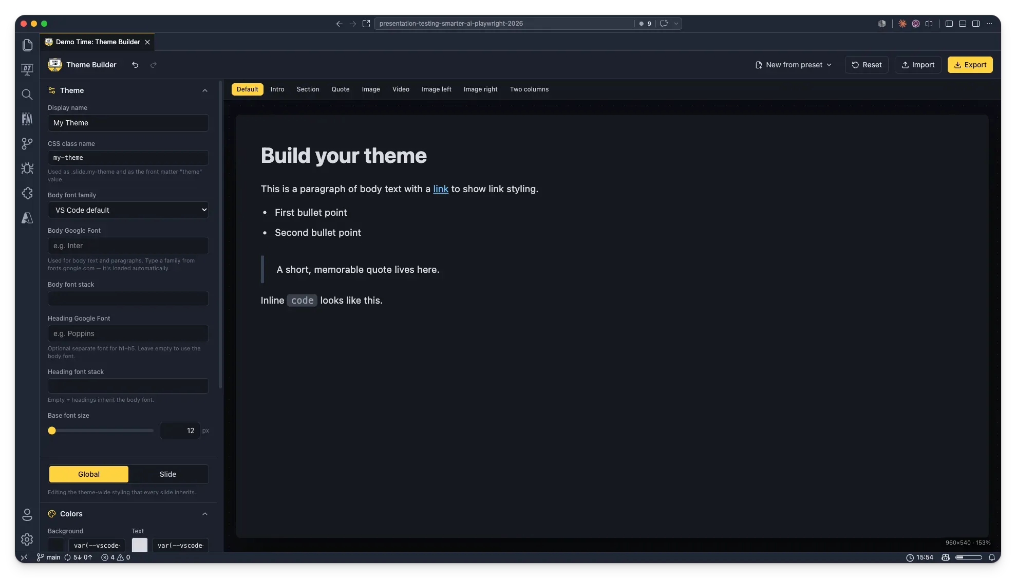
The builder opens in its own editor tab with the controls on the left and a live slide preview on the right. Use the tabs above the preview (Default, Intro, Section, …) to preview each slide layout.
Start from a preset or blank
Use New from preset in the toolbar to start from one of the built-in themes (Default, Minimal, Monomi, Unnamed, Quantum, Frost, Pixels) or a clean Blank canvas.
- A design-based preset keeps the built-in theme’s layout, spacing, and special effects exactly as they are — you edit the colours, fonts, and background image on top.
- The Blank theme gives you full structural control (alignment, padding, and spacing per layout).
Global vs. Slide styling
A toggle at the top of the panel switches what you are editing:
- Global — the theme-wide styling that every slide inherits.
- Slide — the styling for a single layout. Pick the layout from the Layout dropdown (or the preview tabs); its values override the global styling for that layout only.
In both scopes you get the same Colors, Background image, and Typography sections, so you can, for example, give your Intro slides a different background and larger headings than the rest of the deck.
Colors
Set the background, text, headings, links, block quotes, inline code, and accent colours. In the Slide scope you can additionally set a separate Paragraph colour for that layout.
Typography
Control heading sizes and weights (H1–H5), paragraph size and line height, and list size. The Slide scope exposes the same controls as per-layout overrides.
Fonts
Demo Time supports a separate font for body text and headings, and both can be Google Fonts:
- Body font — applied to paragraphs and body text. Pick a preset stack, a Body Google Font, or type a custom Body font stack.
- Heading font — applied to
h1–h5. Set a Heading Google Font or a custom Heading font stack.
Any Google Fonts you choose are loaded together with a single @import in the exported theme.
Import an existing theme
Use Import to load an existing theme .css file (or paste its contents) back into the builder. Themes created with the Theme Builder embed a small data comment, so they re-import with full fidelity; other CSS files are imported best-effort, reading the colours and typography where possible.
Export your theme
Use Export to review the generated CSS and save it. Inside VS Code, Save to workspace writes the file to .demo/theme/<name>.css.
Tick Set as default theme to also update the demoTime.customTheme setting so the theme applies to every slide:
{ "demoTime.customTheme": ".demo/theme/my-theme.css"}Otherwise, reference the theme by name in a slide’s front matter:
---theme: my-theme---
# Welcome to Demo Time!Reset
Use Reset in the toolbar to clear the current theme back to a blank default. The action can be undone with Ctrl/Cmd+Z.